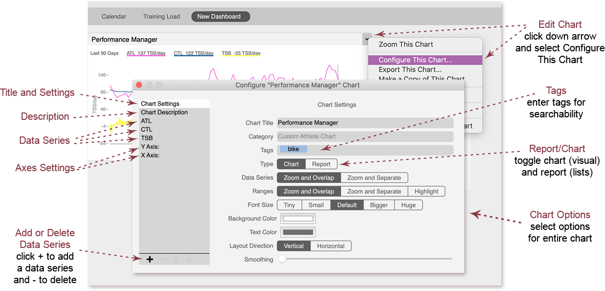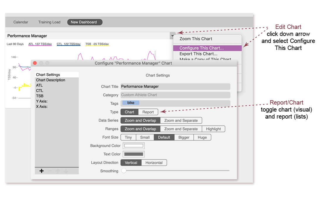
Choose chart or report
Any chart can be toggled to display as a chart (visual lines and bars) or a report (lists of data).
- Click the down arrow in the chart title and select Configure This Chart.
- Click Chart or Report in the Type field.
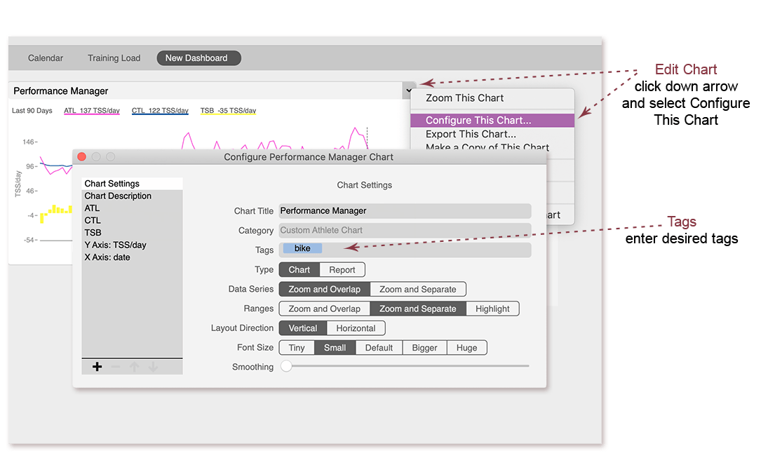
How to tag a chart
- Click the down arrow in the chart title and select Configure This Chart.
- Enter the tag(s) desired in the Tags field.
- All tags entered here are searchable in the Chart Manager.
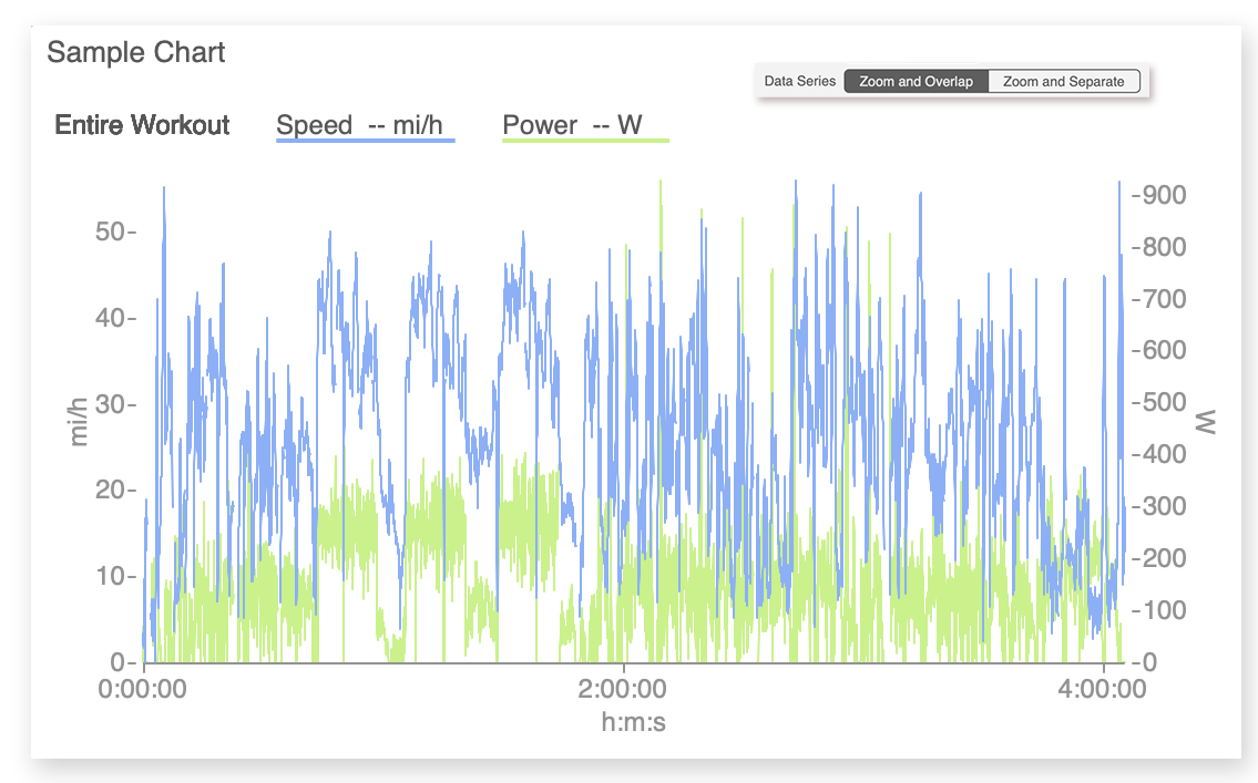
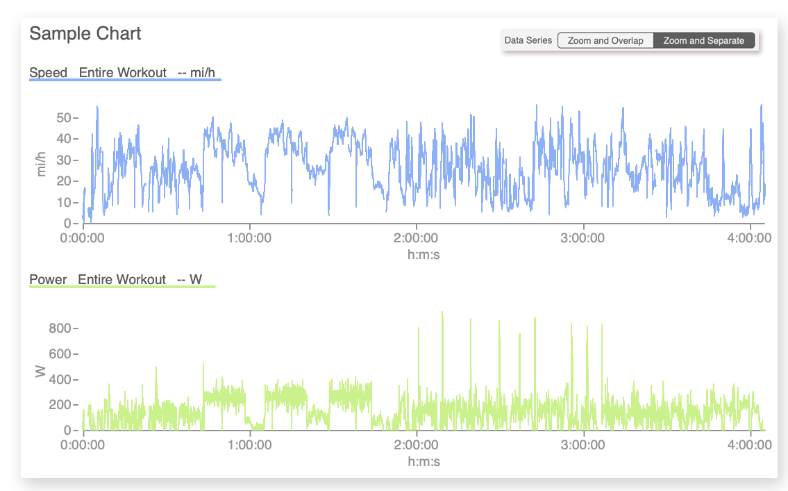
Zoom and overlap data series
When a chart is set to zoom and overlap data series, all data series will display on the same chart face (or line, if a report), and the chart will automatically zoom to the time range selected in the RHE (right-hand explorer).
The workout chart shown here has two data series: speed and power. Speed and power are shown overlapped on the same chart area, and the chart displays the time range selected in the RHE (Entire Workout).
- Click the down arrow in the chart title and select Configure This Chart.
- Click Zoom and Overlap in the Data Series line in the main Chart Settings.
Zoom and separate data series
When a chart is set to zoom and separate data series, each data series will display on its own separate chart face (or line, for a report), and the chart will automatically zoom to the time range selected in the RHE (right-hand explorer).
The workout chart shown here has two data series: speed and power. Speed and power are shown on separate chart areas, and both chart areas display the time range selected in the RHE (Entire Workout).
- Click the down arrow in the chart title and select Configure This Chart.
- Click Zoom and Separate in the Data Series line in the main Chart Settings.
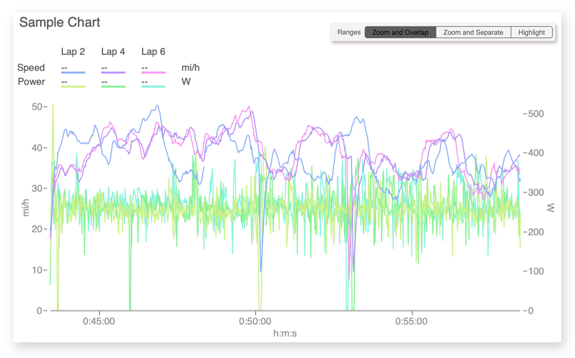
Zoom and overlap time ranges
When a chart or report is set to zoom and overlap time ranges, the chart will display compared data for the time ranges selected in the RHE (right-hand explorer) on the same chart face (or line, if a report), overlapping the ranges. The chart will automatically zoom to the time range(s) selected in the RHE.
The workout chart shown here has two data series (speed and power), and there are three time ranges selected in the RHE: Lap 2, Lap 4, and Lap 6. The color-coded lines for each lap are shown overlapping on the same chart area, and the chart automatically zooms to the longest lap.
- Click the down arrow in the chart title and select Configure This Chart.
- Click Zoom and Overlap in the Ranges line.
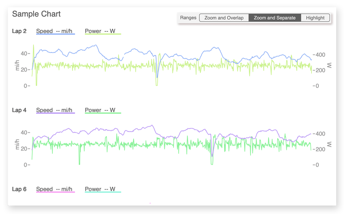
Zoom and separate time ranges
When a chart is set to zoom and separate time ranges, each time range selected in the RHE (right-hand explorer) will display on its own separate chart face (or line, if a report), and the chart will automatically zoom to the time range selected in the RHE.
The workout chart shown here has two data series (speed and power), and there are three time ranges selected in the RHE: Lap 2, Lap 4, and Lap 6. The color-coded lines for each lap are shown on separate chart areas, and the charts automatically zoom to the duration of the laps.
- Click the down arrow in the chart title and select Configure This Chart.
- Click Zoom and Separate in the Ranges line.
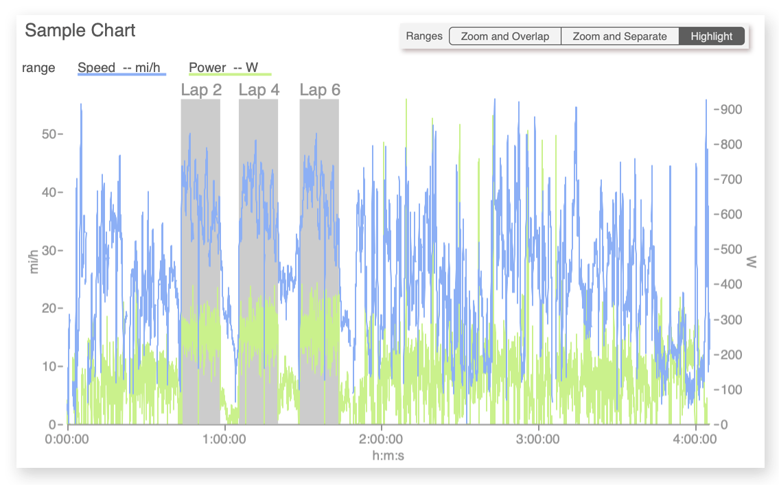
Highlight ranges
When a chart is set to highlight ranges, the chart will always display the entire workout (at workout view) or training history (at athlete view). The time range(s) selected in the RHE (right-hand explorer) will be highlighted and labeled on the chart.
The workout chart shown here has two data series (speed and power), and there are three time ranges selected in the RHE: Lap 2, Lap 4, and Lap 6. The chart displays the entire workout and highlights each selected lap as a segment of the entire workout.
- Click the down arrow in the chart title and select Configure This Chart.
- Click Highlight in the Ranges line.
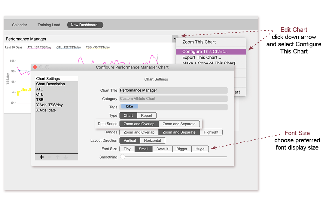
Chart font size
Choose the font size of a chart or report based on your preference and display size.
- Click the down arrow in the chart title and select Configure This Chart.
- Choose the font size desired.
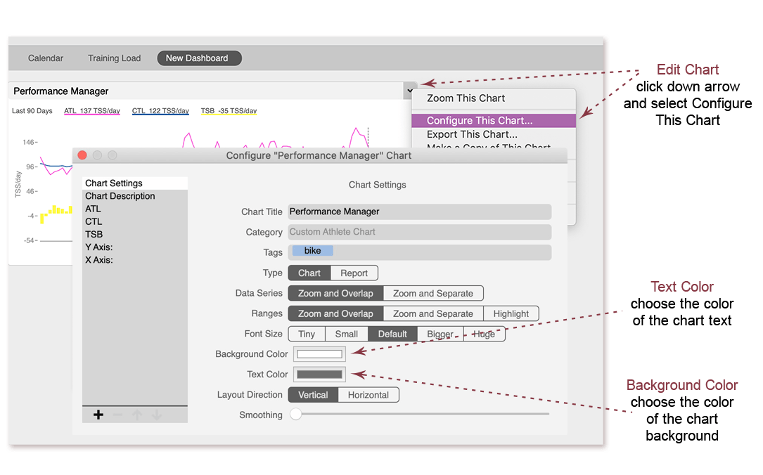
Chart background and text color
To change the background and text color of a chart, simply click the color boxes and select the color you desire.
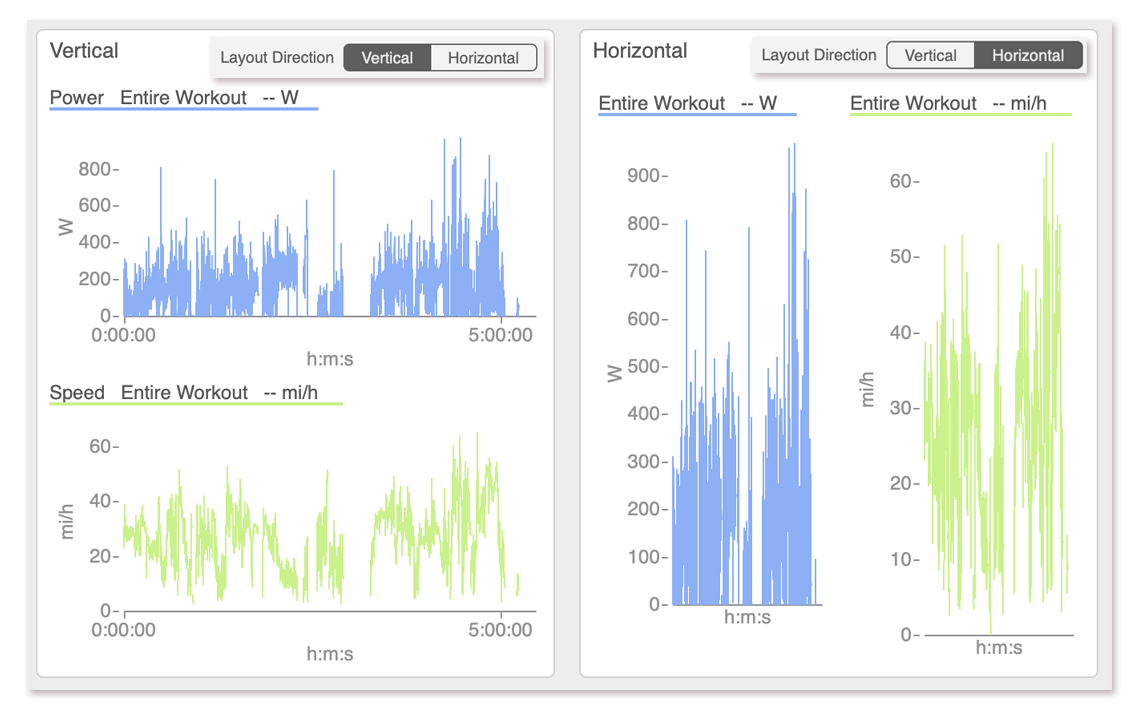
Chart layout direction
When either data series and/or ranges are set to zoom and separate on a chart, the separate chart areas can be displayed horizontally or vertically. This option is not shown for reports.
The workout chart shown here has two data series (speed and power) set to zoom and separate. When the layout direction is set to vertical, the data series are displayed stacked on top of each other. When the layout direction is set to horizontal, the data series are display side by side.
- Click the down arrow in the chart title and select Configure This Chart.
- Click Vertical or Horizontal in the Layout Direction line.
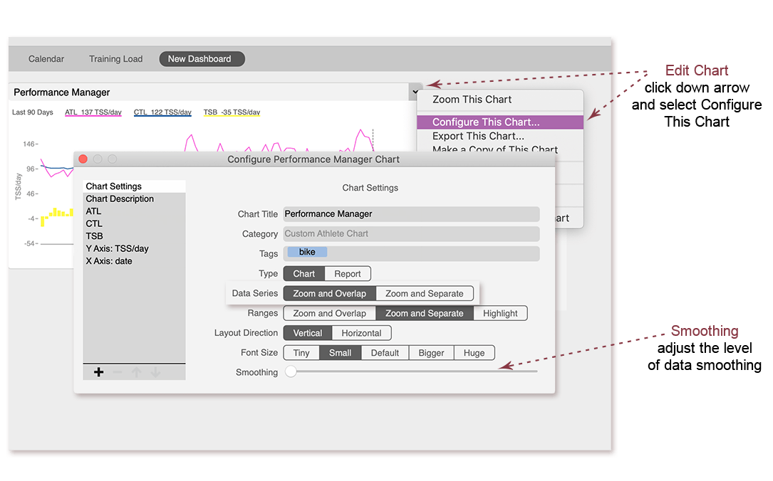
Smoothing data on charts
Data is displayed on charts and reports as it was recorded, or "unsmoothed." If you prefer to display a more general overview or to smooth out gaps in the data, simply adjust the smoothing setting on the chart. This option is not available for reports.
- Click the down arrow in the chart title and select Configure This Chart.
- Adjust the Smoothing slider as you desire.